Data Cruncher Public Interactive Analyses
To help researchers transform raw NGS-based data into clinically actionable knowledge, Seven Bridges strives to efficiently bridge the gap between secondary and tertiary analysis. One of the features we offer to achieve this goal is Data Cruncher, which enables scientists to perform interactive computing and open-ended exploration of data on the cloud. The Data Cruncher Interactive Analyses is a public project demonstrating created with the goal of enhancing end-to-end bioinformatics analysis on the Seven Bridges Platform, offering five interactive Jupyter Notebooks analyses:
- Structural Variant
- VCF Visualization
- Microbiome differential abundance
- ChIP-Seq
Data Cruncher allows scientists to initialize a computation instance and write custom Python, R, and Julia scripts using one of the available computing environments – JupyterLab and RStudio.
Getting started
Obtaining the analyses
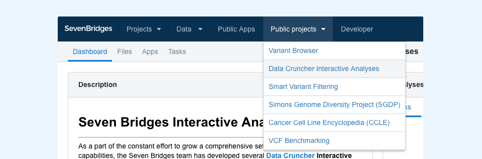
The Data Cruncher Interactive Analysis project is available in the Public projects menu (Figure 1).
Once there, click the “Interactive Analysis” button in the upper-right corner and then choose Data Cruncher, or navigate to a specific analysis by clicking its link in the project description found on the left-hand side. You can copy these analyses to your projects in the same way you would copy apps and workflows.
Obtaining the requisite files
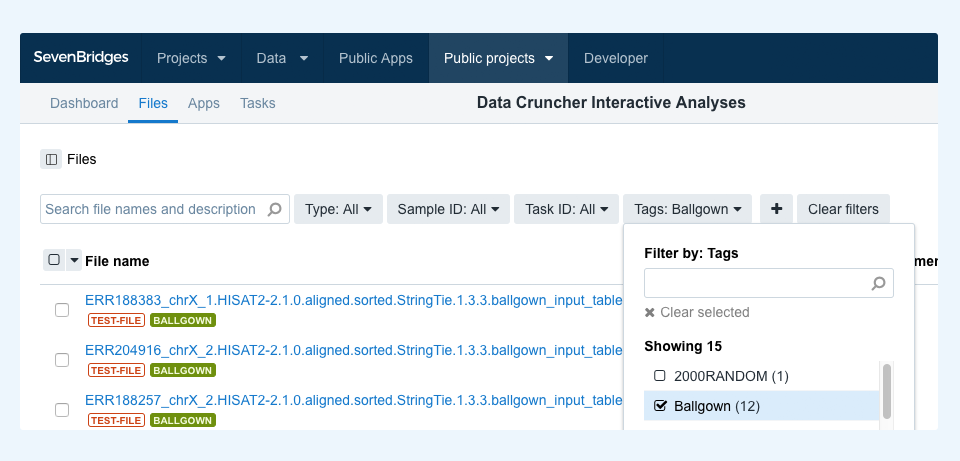
Each analysis may refer to one or more files specific to it. To discover and copy any such files to your project in order to run the analysis, you can filter by tag. For example, to filter for files for the Ballgown Interactive Analysis, go to the project files and choose “Ballgown” in the tags dropdown menu, as shown in Figure 2. This lets you select all the matching files and copy them over to your project together with the analysis notebook. Once both the analysis and files are copied to the project, you can start the analysis.
Finally, if you intend to run these or similar analyses with your own data, each notebook is annotated with comprehensive descriptions and explanations to facilitate customization.
Ballgown Interactive Analysis
Ballgown Interactive Analysis tests for differential expression at the gene and transcript level using FPKM expression measurement data.
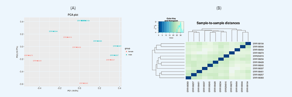
After loading the data, initial data inspection and quality control are performed along with removing low expression genomic features through variance filtration. Then, two differential expression tests are run: principal component analysis (PCA) and hierarchical clustering. Principal component analysis plots (Figure 3a) provide dimensionality reduction of the data while retaining most of the variation in the dataset. By using principal components, each sample can be easily visualized, making it possible to assess similarities and differences between samples. Hierarchical clustering (Figure 3b) represents another exploratory analysis tool which allows grouping of samples or genes together based on similarity of their features.
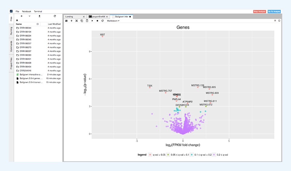
After the differential expression tests have finished, the results are summarized in simple tables showing the number of differentially expressed features for different levels of significance. These results are visualized through volcano plots (Figure 4) and histograms of p and q values.
The data processed in this analysis consists of 12 human RNA-Seq samples containing only reads aligned on chromosome X and is used as example data in Pertea et al., 2016.
VCF Visualization Analysis
VCF Visualization Interactive Analysis offers several quality control analyses of variant call format (VCF) data. This analysis accepts both raw and annotated VCF files without the need for compression or indexing.
The primary purpose of this analysis is to provide researchers with a broad overview of the data. All computation and visualization functions are open and can be modified by the user according to their specific use case. The analysis is written in Python, data-crunched with pandas and scikit-allel libraries, and the results are displayed using the bokeh package.
The main part of the application includes the following analyses:
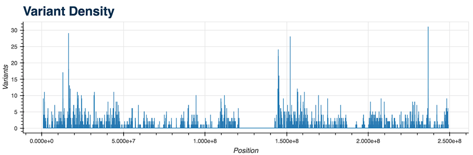
- Variant Density (Figure 5)
- TS/TV Ratio
- Base Changes
- Variant Types
- Insertions and Deletions Lengths
- Variant Quality
- Variant Allele Frequency
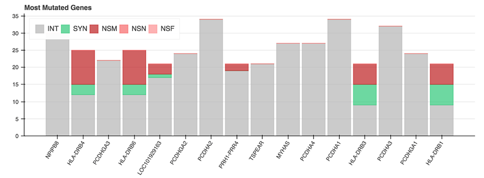
All of the mentioned Python functions can be performed on the entire VCF file or on a specific chromosome. The analysis also includes two more advanced plots: a plot displaying the genes with the most mutations and the mutation type (Figure 6), as well as a plot showing diseases from the CIViC database which correlate with the majority of called mutations.
Structural Variation Interactive Analysis
Structural Variation (SV) Interactive Analysis is a Jupyter Notebook designed for a quick overview of a VCF file containing structural variant calls. The analysis parses the SV caller’s VCF output into a pandas dataframe for simple data filtering and visualization.
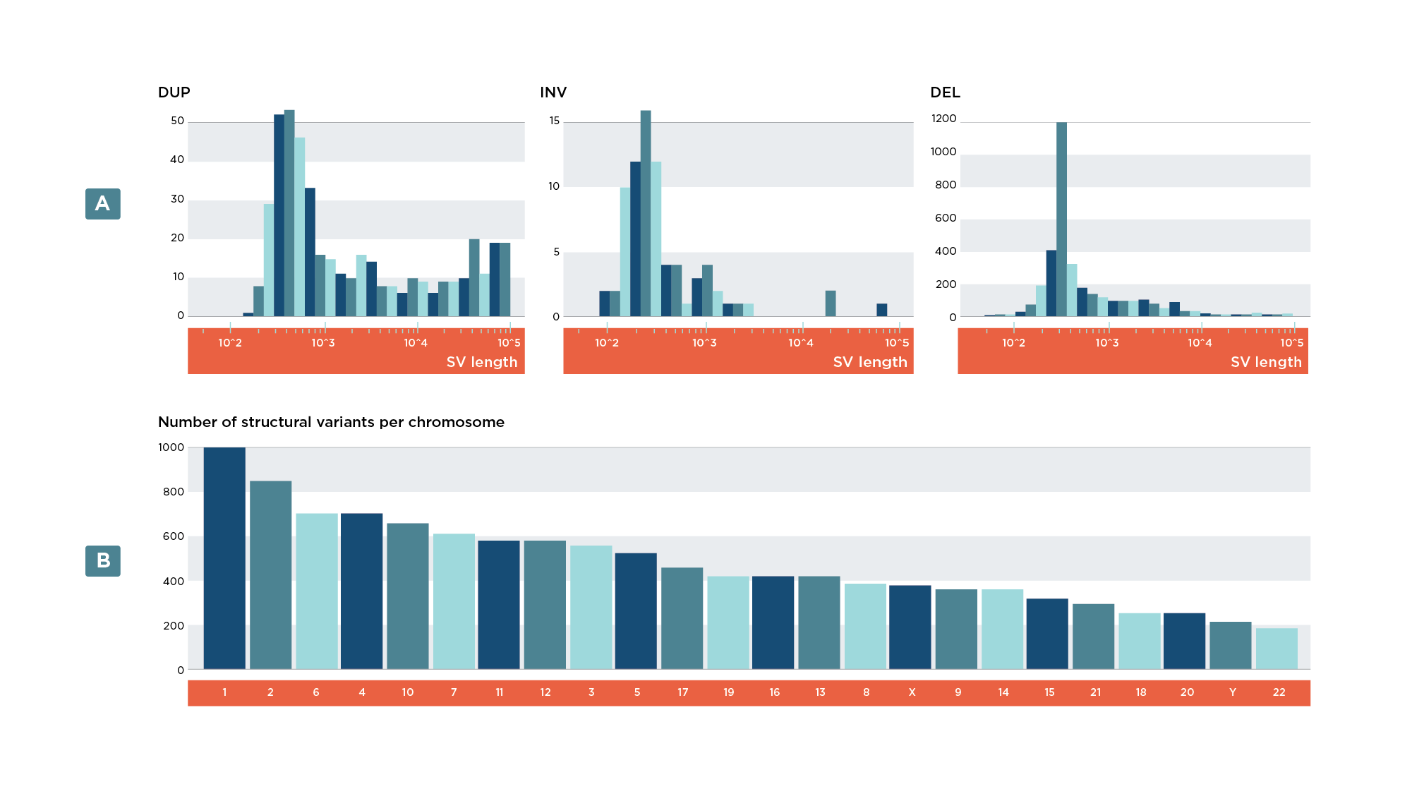
This analysis contains eight customizable visualizations displaying various metrics that can be used to assess the impact of structural variants on a genome and evaluate the performance of an SV caller. Several simple visualizations featured in this analysis examine the different types of structural variants as well as their distribution within the genome. This information can help researchers inspect the biases of different variant callers and sequencing techniques. For instance, certain techniques are better suited for calling particular SV types over others.
The following plots are available through this analysis:
- Bar plot of variants per variant type (Figure 7a)
- Bar plot of variants per chromosome (Figure 7b)
- Heatmap of specific variant types per chromosome
- Histogram of SV lengths
- Distribution of SVs within a chromosome
Finally, the SV analysis contains additional plots and graphics which demonstrate the ability to work with multiple files and external databases. These include:
- Pie charts for inter- vs. intrachromosomal breakends
- Histogram depicting distribution of SNPs in the vicinity of breakends
- Histogram showing the number of SVs overlapping with a gene
- Graphic displaying the highlighted gene affected by structural variation in a pathway (not easily customizable)
These visualizations demonstrate several of the capabilities of interactive analyses and can serve as a starting point for more complex projects.
ChIP-seq Interactive Analysis
The Chromatin Immunoprecipitation Sequencing (ChIP-Seq) Interactive Analysis provides a visualization of the likely locations of transcription factor binding sites or histone modifications.
After performing chromatin immunoprecipitation followed by high-throughput DNA sequencing, sequencing reads are aligned to a reference genome. Genomic regions which are enriched for aligned sequencing reads are then analyzed for statistical significance, and when this data is displayed on a plot of fragment pileup versus genomic position, the peaks on the plot indicate locations of transcription factor binding sites or histone modifications.
ChIP-seq Interactive Analysis uses the bokeh library to enable the visual representation of peaks (Figure 8) identified by MACS2 peak-caller, a tool widely used in ChIP-seq bioinformatic workflows.
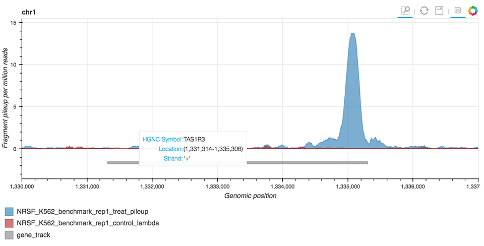
Figure 8. ChIP-seq peak visualization.
Inputs to this analysis include a pre-generated annotation file and MACS2 bedGraph files obtained from the treatment sample and an optional control sample containing information on reads pileups. Researchers can obtain bedGraph files for their own samples by using the Seven Bridges public pipeline – ChIP-seq BWA Alignment and Peak Calling MACS2 2.1.1.
Microbiome Differential Abundance Analysis
The goal of the Microbiome Differential Abundance Interactive Analysis is to detect differential abundance of microbes between two predetermined classes of samples. This experimental design is applicable to case-control clinical studies and other settings for which there is prior assumption about the existing microbiological conditions within the different groups of samples.
This analysis relies on results of the metagenomic workflows performing the profiling of microbial communities from metagenomic shotgun or 16S rRNA sequencing data. Input to this analysis includes tables containing information on mapped read counts, taxonomy, and clinical data relevant to the sample (provided by the user). Counts and taxonomy tables are default outputs of MetaPhlAn 2, Centrifuge, and QIIME2 metagenomic workflows, all of which are available on the Platform. The BIOM file format, which also contains these tables, is supported as well.
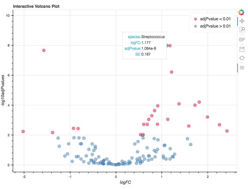
The analysis is written in R and Python combined and runs within Jupyter Notebook. The code enables the visualization of relative abundance of the most abundant taxa and the differential abundance analysis (Figure 9) using the fitFeatureModel() or fitZig() functions of the R package metagenomeSeq.
Additionally, this notebook comes with a distinctive “flavor” – metagenomeSeq methods are called directly from Python, using rpy2 which conveniently enables an interface between Python and R. Since both languages can be interchangeably used in cases of data exploration and visualization, this analysis can serve as a practical guideline for combining the languages within the same notebook and hence help researchers get the most out of the analysis.
Conclusion
These five examples give you a taste of how to use Data Cruncher in concert with the data already on Seven Bridges to create integrated and interactive tools for exploring and presenting results. Whether you intend to modify one of our examples to suit your situation or intend to build your one from scratch using Jupyter, RStudio, or Julia, you will find these public interactive analyses are a useful starting point for your tertiary analyses.
To learn more about these topics, explore our Knowledge Center: